How to read our bottles

Take a peek behind the curtain on our label design!
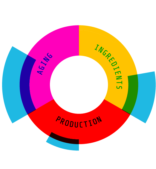
By now, you're sure to have seen the flavor projection (it’s on our bottles and all over our website):

Hannah Coward designed this graphic to be a precise, but not overly dogmatic, representation of what *we* want to tell *you* about the product we're curating/repping/excited about. But, if you've learned only one thing about Pekut and Carwick, it's that we don't like hollow marketing ploys. Even (especially?) beautifully designed hollow marketing ploys.
With us, if it looks systematic, that's because it is.
We're flavor nerds, and since we're in the business of bringing flavors and aromas to you, we naturally want to know where they come from - and how to get more of them. Since the character of a spirit can only really come from three places (ingredients, production, and aging), it makes sense to categorize flavors and aromas using these three "life phases" of a spirit.
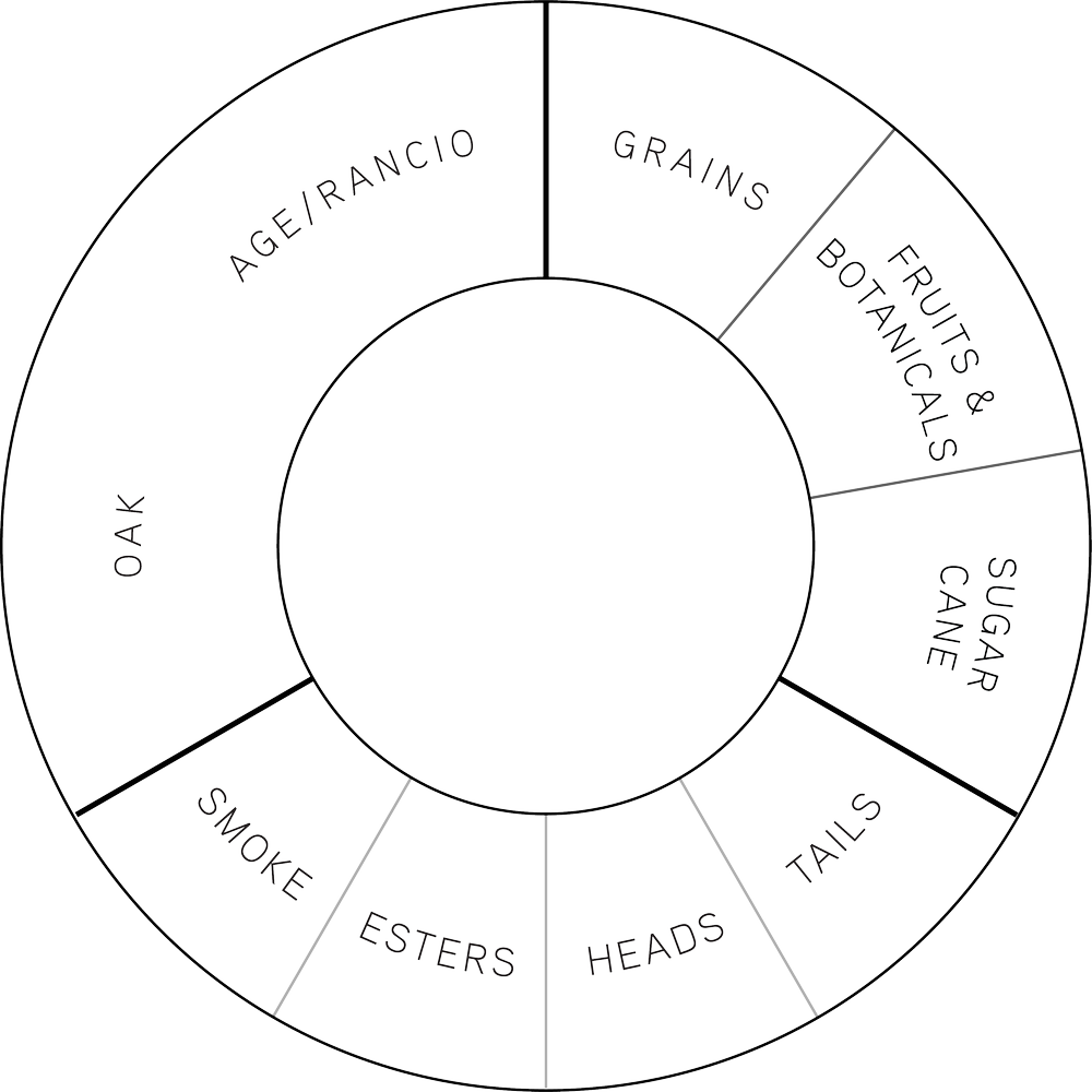
Here's how we see the label projection behind the scenes:

The Pekut and Carwick flavor projection showing aroma and flavor source subcategories.
Inspired by the Wine and Spirits Education Trust (WSET)'s approach to categorizing flavor and aroma, we divided the projection into nine sectors. For every release, we put a thick blue stamp over the sector we feel is most influential to the experience you'll have when you consume our product, and a thin blue stamp over sectors that play an important background role.
Do you like being smacked in the mouth with big, oaky, dankness? Look for a THICK blue stamp over the "OAK" sector of the projection (and check out our Heritage California Single Malt).
Do you love a fruit-forward liqueur? Look for our projections that feature only the blue stamp over the "FRUITS AND BOTANICALS" sector (check out our Prunus Mume liqueur and our Citrus Aurantium Vin d’Orange).
Are you a rum nut like us? Look for our projections that feature the blue stamp over the "MOLASSES" on our Bulk Rum from Guyana).

